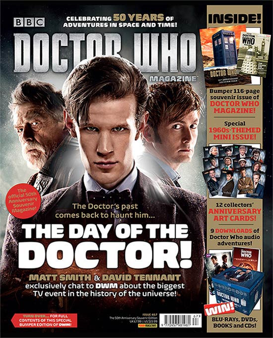
Based on this cover magazine the layout of the text on the left hand side of the cover the layout of the tag lines/featured stories is really eye catching and feel that by implementing that in my work could be very effective.

The tag line of "secrets" is another aspect of this magazine that i believe will attract my audience as they may want to find out more.

The use of the header i feel is good way to attract my audience by saying "official" attracts people to the magazine as they feel that what they are reading is the inside information making my audience feel valued.
The idea of the competition is another aspect of the magazine that i will implement in to my work as i feel it is an effective way to attract the audience to my magazine and my program.
cast interview is another method that has been used in this magazine cover which i will also use in my magazine, my providing inside access to my audiences means that they feel more valued but can also want them to want to find out more information about my program.
An example of a souvenir magazine
- titles of publication- the title of the magazine is "Doctor who magazine" the reason for this is because doctor who is well recognised program that has a large fa base, by having the tile as doctor who gets straight to the point and attracted them to buy it.
- slogan- the slogan in this magazine is "celebrating 50 years..time!" this has been added in order to attract the audience and give them a reason to buy this magazine.
- central image- the central image is of the doctors across time, the use of having a image with all the doctors, means that can appeal to audiences. Having a large image means that attracts audience also because of the three characters people may recognise them and buy the magazine.
- "flash"/cover lines- "The doctors past comes back to haunt him" this is an example if a good cover line because it attracts the audience to want to read more and to find out mro information. "the day of the doctor" is an example of a good cover line because ti attracts the audience of wanting to read more and know why the day has come, it is placed in the middle of the page in order to ensure the audience see it and are attracted to the magazine.
- free offer- 12 free collectors anniversary art cards and also 9 downloads of doctor who audio adventures. this an example of a free offer which allows audiences to feel that they are getting value and something in return, for fans it can be seen as a factor that attracts them to buy as they may be collecting the doctor who merchandise.
- colour scheme- the colour scheme of this magazine uses colour like red , black , white and gold this has been done in order to keep the colour scheme simple but also attractive , the red is very eye catching and therefore attracts the audience to the cover the red connotes blood and detective theme. the white connotes purity and also stands out against the red.
- names/game check- the magazine fully based around doctor who and is the main focus of the magazine, this has been done in order to attract doctor who fans but also helps audiences establish what the magazine is about but also if it appeal to them.
- language- the word "doctor" is in capitals which can attract audiences to take an interest in the magazine but also be attracted to it. The font is also another factor that can attract audiences to the magazine bold and big font can attract audiences as it is eye catching . the use of smaller font also help keep audiences attracted as it means that audiences have to get closer in order to read more about the magazine and what it is about.
- competitions- win Blu-rays , DVD's , Books and CD's is the competition with an image to show what is to be won.
- direct address & asking questions- not applicable
- Barcode, date and price- is at the bottom three quarters to the right which has the price , date , issue number and Barcode.
- the "real" target audience- the audience for this magazine cover is ages of 7 and above the reason for this is because the program is i aimed at families and also appeal to much older people. The reason it appeal to older people is due to the use of the older doctors that had stared in the program before which means that a range of people would take an interest.


No comments:
Post a Comment